Futura BT vs Futura PT

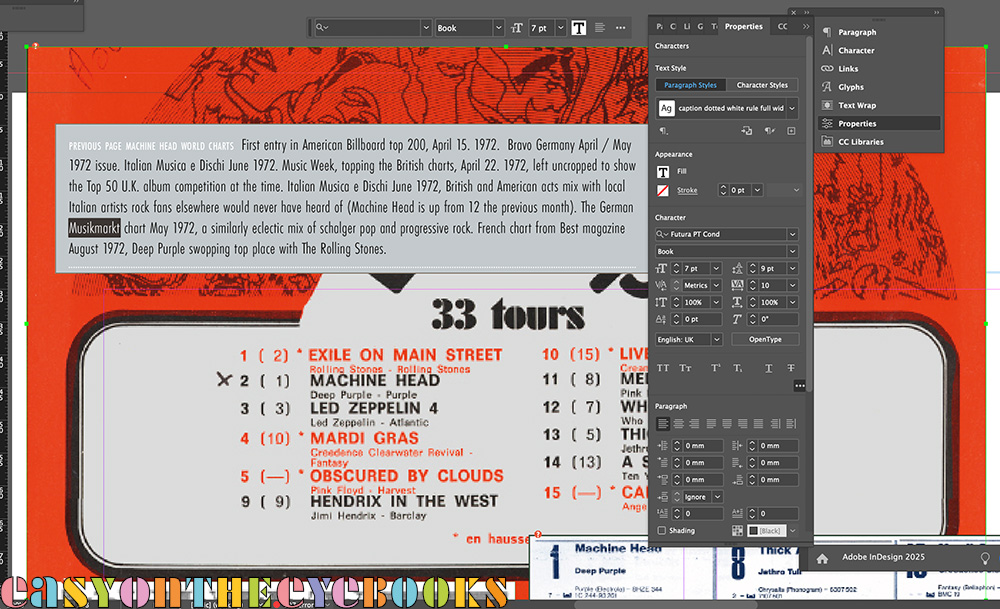
Just what we don’t want to see after opening a file! The salmon coloured rectangle indicates a “problem with the type”. And how. All squashed together and the wrong typeface as InDesign makes a ‘guess’ at what to do while updating. The Adobe software people have been changing how they integrate their font library with their software for a couple of years now, and in between last looking at this section of the book and reopening it (to add half a dozen words) the deadline warnings I have been ignoring all that time have finally past! So after a bit of a panic, it was a case of delving into the appropriate menus where the issues were all neatly flagged up. Having checked the affected fonts, I could then substitute the new versions one by one. So now it is Futura PT instead of Futura BT (a font dating all the way back to 1927). Happily this seems to have sorted the issue as the refreshed screen image below shows. The error window did also flag up a font called Calibri as being missing too. I’m not even sure what that looks like, never mind specifying it. I checked up and it is a poor man’s Gill, so maybe comes from a previous font substitution. In the end I took a chance and deleted it. The world hasn’t fallen in. At least this small part of it.
The image under the errant caption? A part of the French top albums chart from August 1972 on a page devoted to Machine Head round the world… I then got distracted by the layout and ended up spending two hours tweaking the page, moving things about and trying to squeeze one more image into an already full grid!